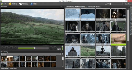
The user interface in Fast video cataloger is key to how you can work efficient with videos. In the first version of the program the interface was fixed. This was setup how I prefer to have my windows arranged. Problem was that my preference is not necessary yours. To solve this we changed to a docking user interface where you can decide how to arrange your windows. This allows you to setup the windows in a way that suits you and what you are currently using the program for. I also added support to have the layout across multiple computer screens. When working with Fast video cataloger and your video library I highly recommend a multiple screen setup. So with Fast video cataloger 2 we have a docking user interface that could be configured across multiple computer screens and that stored the layout between program runs.
What did we change in Fast video cataloger 3?
Let’s face it, even though the interface was really practical it did not look very good, especially if you compare to other video programs. In Fast Video Cataloger 3 we have done a complete redesign of the visual style of the GUI. The functionality is still the same and you can still work with videos across multiple computer screens. The interface now shares a style similar to other popular graphics programs.
Here is the first screenshot from the new interface
It’s now 2 days left until fast video cataloger is released. More update changes tomorrow.

